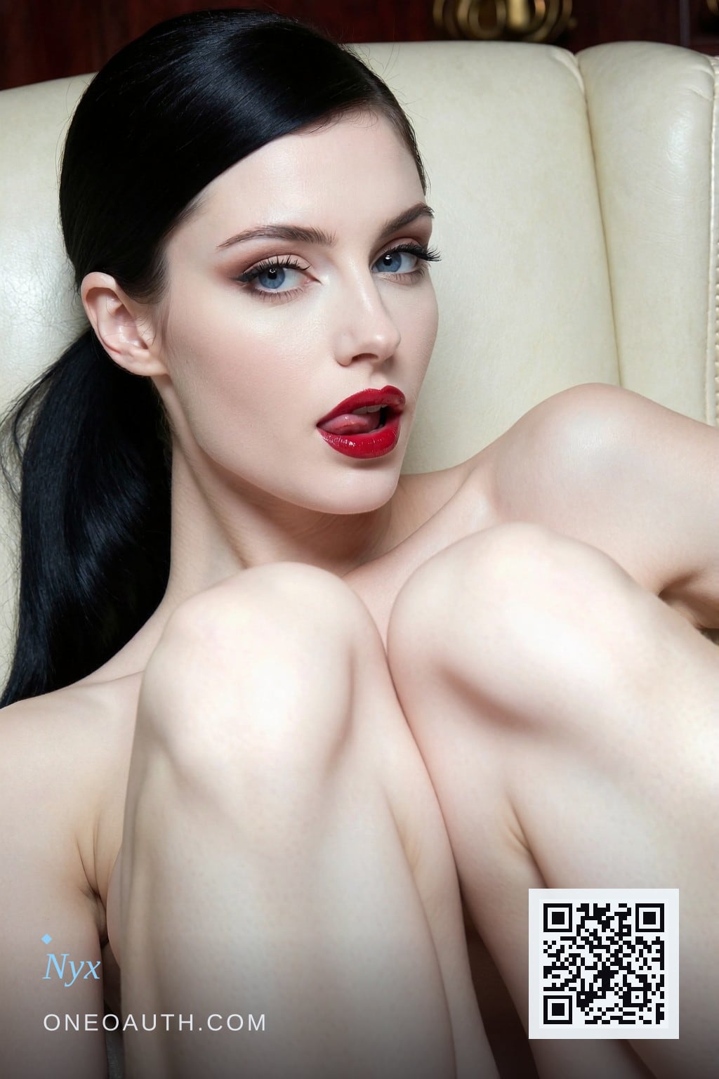
What does the blue-eyes-black-hair combination actually mean?
The combination means something older than the question, and the question is older than the listicles trying to answer it.
When people type *blue eyes black hair character archetype meaning* into a search bar, they are usually asking one of two things: how to draw a character who reads as interesting, or what the combination signals when they see it in a face. The first question is for designers. This essay is not for designers. It is for the second kind of reader — the person who keeps noticing the look in paintings and on feeds, and who wants to know why it has been there for two hundred years.
The honest answer is that the combination was never invented. It was noticed. Someone, centuries ago, noticed that dark hair against pale irises produces a face that reads as difficult to place — the hair says one thing about a person's colouring and the eyes contradict it, and the contradiction holds your attention half a second past the point where a resolved face would have released it. The noticing got codified into a recipe. The recipe got re-rendered for every visual medium that has come along since.
What follows is what the code actually carries, where it came from, and why the version of it on screens now is not the goth look the internet keeps mistaking it for.
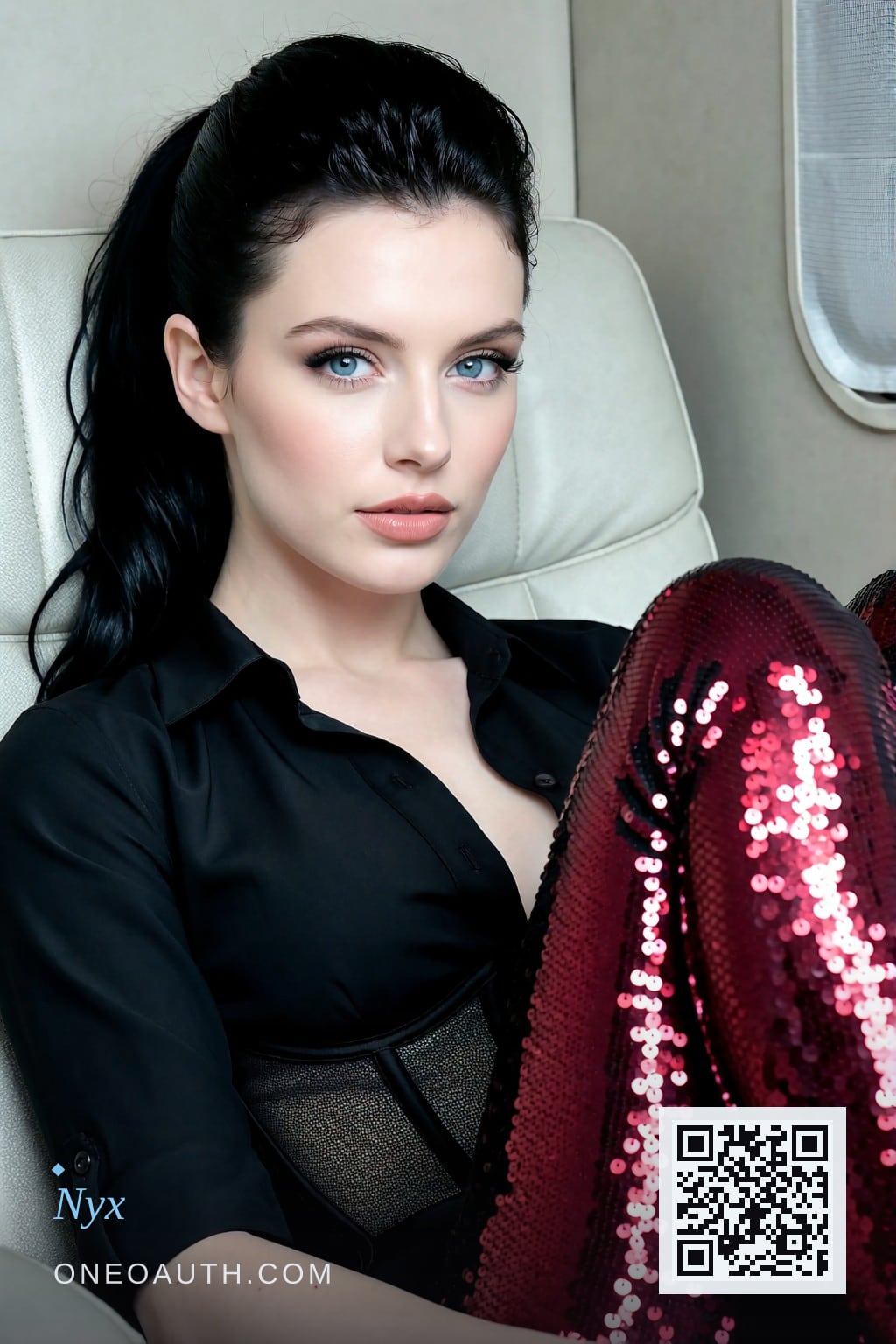
Where the visual code comes from
The recipe that everyone is still looking at was written down in 1812. In the Grimm Brothers' *Kinder- und Hausmärchen*, a queen sewing by a winter window wishes for a child with skin as white as snow, lips as red as blood, hair as black as ebony. That is the whole formula. Three values placed against each other: the lightest possible ground, the darkest possible frame, one small warm note so the face does not read as a corpse.
It is worth noticing that the recipe never specified the eye colour. The Brothers wrote about a contrast ratio, not a face. What they did specify — pale ground, dark frame, one warm note — is exactly what the combination delivers when the irises are light enough to read against the hair and pale enough to merge with the skin. Blue eyes are the natural outcome of the recipe. They are not a separate aesthetic stacked on top. They are part of the contrast ratio working as designed.
What the Pre-Raphaelites added to the look
In 1848, a handful of young British painters founded the Pre-Raphaelite Brotherhood and announced, in effect, that they were tired of academy polish. They wanted the seriousness of painters before Raphael. They wanted the awkward, the particular, the slightly too long necks and the hands that you could tell had weight.
What they kept from the tradition before Raphael was the colour logic. What they added was the *character*. Before the Pre-Raphaelites, the blue-eyes-black-hair combination was a colour recipe. After them, it was also a personality.
The personality arrived through specific faces, and it is worth knowing who they were because the internet has since flattened them into a mood-board. Elizabeth Siddal was a Pre-Raphaelite model and later a painter in her own right — pale, dark-haired, light-eyed, and serious in a way that photographs of her still refuse to flatten into prettiness. William Morris's wife Jane Burden, posed by Dante Gabriel Rossetti, became one of the most reproduced faces in Western art: dark hair, pale skin, heavy-lidded eyes that read as thinking rather than inviting. The combination was not posed as decorative. It was posed as a person — a particular kind of person, with a particular kind of attention in her face.
This is the part the listicles get wrong. The look is not a mood. It is a *type of mind*. The Pre-Raphaelite muses were not decorative. They were the painters' working definition of what a serious woman looked like when she was not performing for the camera.
The Waterhouse posture and why it travels
The painting that fixes the combination in its current shape is John William Waterhouse's *The Lady of Shalott*, painted in 1888. She is in a boat, drifting. Her hair is loose, very dark, very long. Her skin is the white of unbleached linen. Her eyes are looking at something we cannot see.
That is the posture that travels into the modern archetype: the gaze that implies the woman is thinking about something other than the person looking at her. Not an invitation. Not a refusal. A direction-of-thought that simply does not include the viewer.
Every subsequent version of the look — in oil, in magazine print, in film, in anime, in generative models — is doing some variation of what Waterhouse fixed. The colour recipe was older than 1888. The framing was older. What 1888 added was the marriage: pale skin, dark hair, light eyes, and a face that is not yours to claim.
The cold surface hides warmth underneath
This is the part of the archetype that the internet is most consistently wrong about, and it is the part that matters most.
The combination is cold. There is no point pretending otherwise. Cold palette. Cold lighting. Cold gaze. Snow-and-ice colour logic, going back to the 1812 recipe and forward through every painter who ever used it. A face with this combination reads as winter-coded, distant, slightly inhuman in its composure.
What it is not, despite the internet's insistence, is goth.
Goth is a subculture with a wardrobe, a music history and a deliberate signal of separation from ordinary life. Black makeup, black clothes, the whole thing worn as a statement of belonging somewhere else. The archetype has no wardrobe. Strip the eyeliner, the lace and the intent, and what is left is a woman who could be standing in a Pre-Raphaelite studio in 1860 or a film still in 1955 or a feed today. The archetype survives intact without any of goth's signal-noise, because the archetype is doing different work.
What it actually carries is cold *and* the warmth. That is the part the listicles miss because the listicles are written by people who have looked at the colour combination and never read what the women holding it were doing with it.
Elizabeth Siddal was a painter. Jane Morris sat for hours in heavy gowns while Rossetti worked, and her expression in those sittings reads as patience rather than invitation. The Pre-Raphaelite muses were collaborators in the slow construction of a serious image, not decorations inside one. The coldness of the look — the pale skin, the distant eyes, the dark hair — was the surface. The warmth was the work the woman was doing while you looked at her.
That is the meaning of the archetype. Cold on the outside, occupied on the inside. A face that holds attention because it has not resolved, paired with a person who is clearly doing something you cannot see.

How the combination kept being re-rendered
The look moved through the twentieth century by being re-rendered for every medium that tried it.
Alberto Vargas painted his first Varga Girl for *Esquire* in 1940, and over the next twenty-five years she appeared in roughly nine million copies of the magazine on bar walls, on lockers, in mess halls. The colour logic did not change; only the audience and the surface did. Black-and-white Hollywood ran the same combination industrially — Hedy Lamarr, Vivien Leigh, Ava Gardner, the early Elizabeth Taylor — because monochrome film rewards dark hair against pale skin more than any other colouring, and the studios knew it.
Anime inherited the code through different routes, mostly via the yamato nadeshiko figure and her successors — the cold, dutiful, beautiful woman whose distance is read as depth rather than refusal. Genshin Impact and similar modern character-design systems have codified the combination as one of the stock "interesting woman" archetypes, complete with personality tables assigning blue-eyed, dark-haired characters traits like "aloof," "intelligent," "restrained." The listicles that rank these characters are reading the same code the Pre-Raphaelites were reading, which is why the search results for the phrase are full of personality tables and not art-history essays. The internet is repeating a 173-year-old observation in different vocabulary.
The most recent medium — generative imaging — has produced the code at scale. The LoRAs behind the modern archetype were trained on the same paintings, the same magazines, the same film stills that produced the original noticing. They did not invent the look. They inherited it.
What the code means in practice
Strip the listicles, the personality tables, the anime wikis and the AI-art subreddits. What the combination means is two things, and they are the same two things the Pre-Raphaelite muses were doing in 1860.
First, the look is a contrast ratio, and a contrast ratio is structural. It does not date. The Gibson Girl dated. The flapper dated. The pin-up dated. The cold blue gaze against dark hair has not dated, because contrast is not a silhouette. Anything that depends on a contrast ratio will be re-rendered by every medium that comes along, because contrast is one of the few visual elements that gets sharper as resolution gets worse, not better.
Second, the archetype carries the cold and the warmth. The cold is the colour logic: pale, dark, blue, distant. The warmth is what the woman holding that colouring is doing while you look. The combination is not decorative. It is a specific claim about a specific kind of person — a person whose interior is occupied, whose attention is somewhere you cannot see, whose face does not exist to be claimed.
That is the answer to the question, and it is what every face at /visions is doing. One recurring ideal, a hundred different faces, all of them carrying the same cold code and the same warmth underneath it. The faces are AI-generated. The archetype is older than any of them, and is the reason they read the way they do.
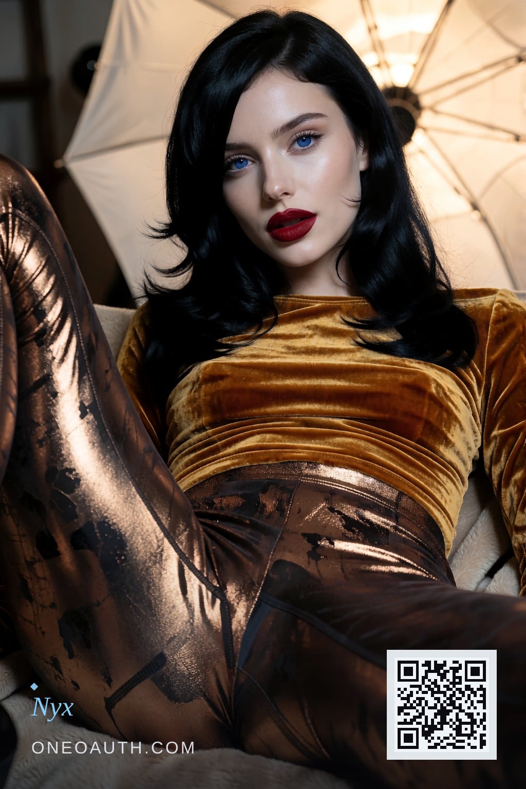
If the combination is what you keep noticing — in a painting, in a film, in a feed that mostly shows faces — and you would like to see what it looks like at the current resolution, start at /visions. One ideal, many faces, all of them the same code, every one of them generated.